Building a Site That Doesn't Look AI-Generated (Using AI)
What I Built
I rebuilt this entire site in about five days. New navigation, new type system, new layout primitives, new everything. The catch: I'm an engineer who has never had formal design training, and my primary collaborator was AI. The goal was a site that felt like me, not like a template.
The Problem
The previous version of this site was fine. Dark background, clean layout, readable. It also looked exactly like what it was: a developer who grabbed a starter template and filled in the blanks. You could squint at it and see a dozen other sites that looked the same.
That's the trap with AI-generated design. The defaults are competent. The spacing is reasonable, the colors don't clash, the typography is legible. But competent defaults produce generic results. Everything converges toward the same look because the model is drawing from the same distribution of "good enough."
I wanted something that had a point of view.
How I Built It
Starting with research, not prompts
The single best decision I made was not touching code for the first two days.
I started bookmarking sites I liked. Screenshots from designers I follow on Twitter, portfolio sites that looked good, random stuff that caught my eye. I threw it all into a doc. No real system, just "this looks cool, why?"
Once I had enough material, I started brainstorming with Claude. I was asking it why certain sites grabbed my attention, what made specific layouts feel more intentional than others. I was trying to learn the vocabulary so I could better explain to my AI tools what I actually wanted. Three docs came out of that, about 850 lines total. I'm still no expert, but I think using AI to teach yourself to think in a new way is more valuable than just having it think for you.
If you want to try this yourself, you don't need my specific references. Just start saving things that stop you mid-scroll and ask yourself why. The references matter less than the act of studying them.
This was the part that made everything else possible. By the time I started writing code, I had a vocabulary for what I wanted. I could say "binder-tab navigation where the active tab physically connects to the content panel" instead of "make the nav look cool." I could say "monospaced uppercase labels with wide tracking" instead of "make it look technical."
The research docs became a shared language between me and the AI. Instead of generating from defaults, the AI was working from a specific, opinionated brief.
Translating research into code
The actual implementation landed in one big commit: 21 files changed, +1,251 / -973 lines. That sounds dramatic, but because the design direction was already locked in, most of the back-and-forth was about execution, not taste.
Here's what the system looks like:
Three fonts, each with a job. Instrument Serif for display headlines. Geist Mono for labels, metadata, navigation. Geist Sans for body text. The contrast between the elegant serif and the rigid monospace is intentional. That tension, refined and mechanical in the same frame, is the whole personality of the site.
Grayscale with one accent. The palette is mostly grays and off-whites, with green (#4ade80) as the only real color. There's a few shades of it, kind of a green-scale that mirrors the grayscale ramp, but it's all the same hue. It shows up on status indicators, hover states, active navigation tabs. Sticking to one color is harder than it sounds, but it means every pop of green actually draws your eye somewhere useful.
Binder-tab navigation. The nav tabs have a bottom border that matches the content panel's top border, so the active tab looks like it's physically part of the content below. Like dividers in a reference binder. The labels use operational language: OVERVIEW, CAPABILITIES, DISPATCHES, ANALYTICS, CONNECT. Not "Home, Services, Blog."
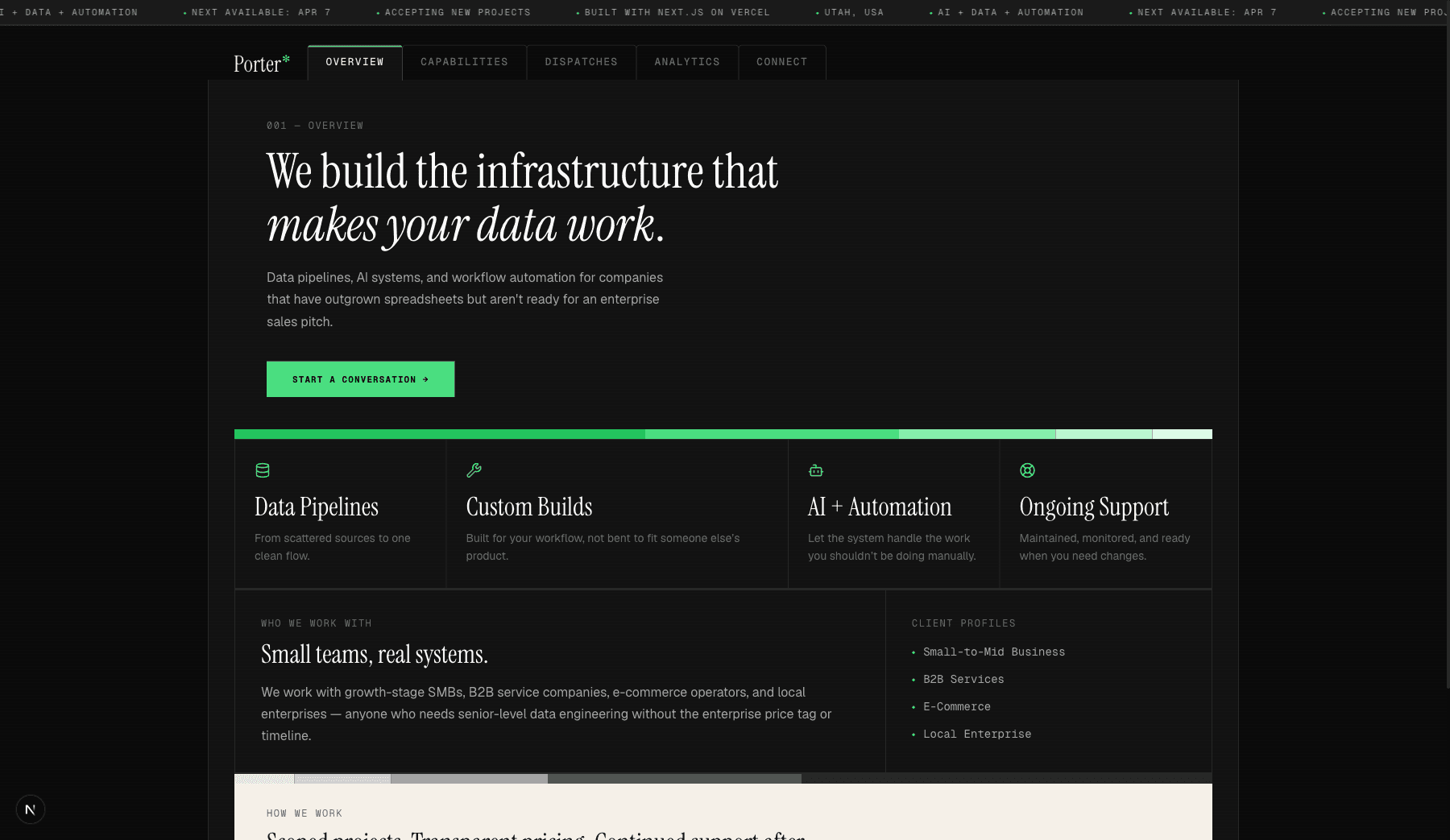
Panel-based layouts. No rounded corners, no shadows, no gaps between panels. Bordered rectangles, visible structure, like a technical manual or a dashboard. BentoGrid components with golden-ratio column templates so the asymmetry feels designed rather than random.
Redesign by the numbers: 21 files changed, +1,251 lines added, -973 removed. 7 new components. One deleted.
Warm cream panels for rhythm. Scattered throughout the pages, these "spec sheet" sections use a cream background that references printed technical documentation. They break up the dark sections and give the eye a place to rest.
Where the human taste matters
The tricky thing about using AI for design work is: AI is great at execution, but terrible at taste. (I guess taste is subjective so maybe I'm terrible at that too.)
It can write a perfect CSS Grid layout. It can set up a type scale with mathematically correct ratios. It can build a responsive navigation that works on every breakpoint. What it can't do is look at the result and tell you it feels generic.
That's where all the research pays off. Just saying "no, try something else" is a great way to go in circles and get frustrated. But when you can say "the heading needs to be Instrument Serif, not Geist Sans, because the serif is what gives this page personality," or "these capability cards need more breathing room, try a golden-ratio column split instead of equal widths," the AI can actually do something useful with that. The research wasn't just for vibes. It gave me the words to steer the conversation.
The back-and-forth looked like this: AI generates a component. I look at it. Something's off, maybe the heading is too small, maybe the spacing between the label and the content is too tight, maybe the panel border feels heavy. I describe what's wrong in specific terms. AI adjusts. Repeat until it clicks. Some components took two rounds. Some took ten.
The Result
The site went from "developer template with content filled in" to something that feels intentional. The numbers: 7 new UI components, a CSS file that grew from 200 to 540 lines of design tokens, 6 type scale levels, 6 grid ratio patterns, and 5 follow-up refinement commits after the initial redesign landed.
More importantly, it doesn't look like any specific template or design trend. A lot of the details that make it feel less generic were my ideas, not the AI's. The gradient color strips that break up sections, the icons on the capability cards, the operational language in the nav labels. The AI's first pass was text-heavy and kind of flat. Those small human touches are what keep it from feeling like a wall of AI-generated content.
What I Learned
Design research is underrated. Writing 850 lines of "why does this work" before touching code felt slow. It was the fastest path to a coherent result. Without it, I would have been making isolated decisions, nice button here, interesting layout there, that never added up to a system.
AI is a better collaborator than a creator. When I asked AI to "design a portfolio site," I got portfolio sites. When I gave it a detailed brief with specific references and vocabulary, I got something personal. The quality of the output is directly proportional to the specificity of the input. That's not a limitation of AI. That's how creative collaboration works with humans too.
A site is never done. I've pushed five refinement commits since the initial redesign. Bumped font sizes for readability. Rewrote copy on the services page. Built the mobile navigation. Every time I look at the site I notice something to adjust. It's not a finished artifact, it's a living portfolio that keeps changing as I notice things. That ongoing conversation with the work is the actual design process. The initial build was just the first draft.
Being an engineer who doesn't come from design is fine. I don't have opinions about kerning or color theory. I have opinions about how things should feel when you use them, whether an interface communicates competence, whether it's clear where to look next. Those are valid design instincts. The design research helped me connect those instincts to the vocabulary and tools that could express them.
The site you're reading this on is the result. It's going to keep changing.